Self guided onboarding for IT teams
Self guided onboarding for IT teams
Role
Product design, user journeys, co-design strategy, conceptual design, prototyping, UI system
Duration
March 2020 - Nov 2020
Context
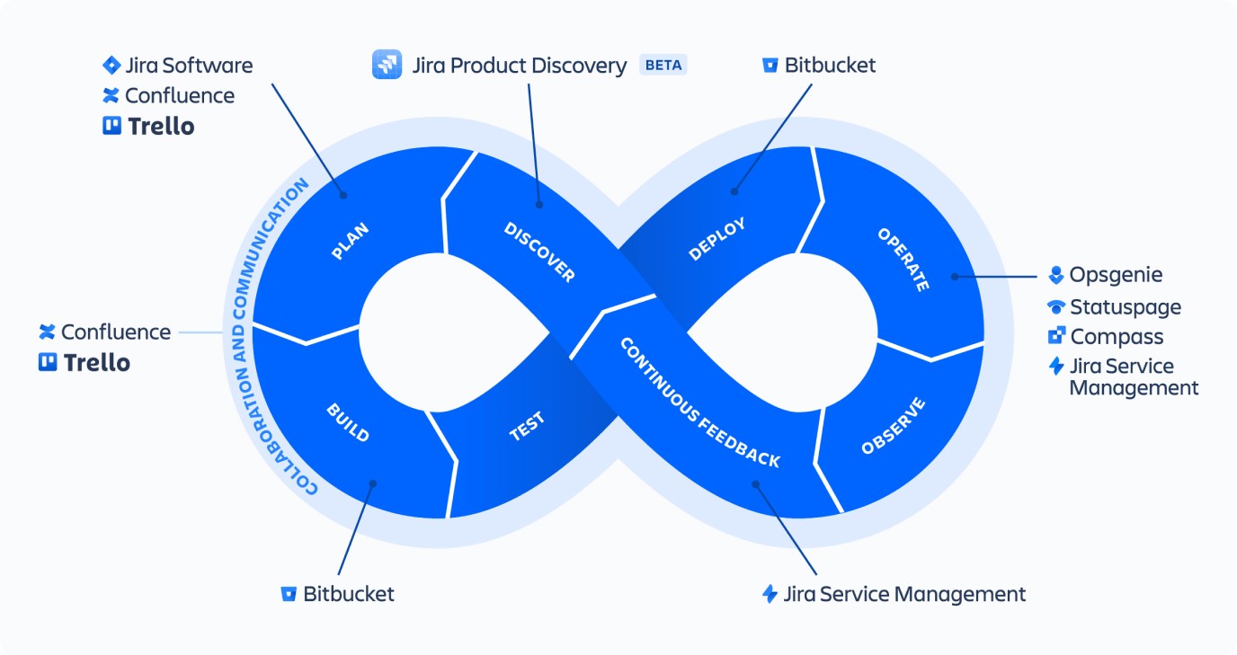
Service management for the modern IT team
Atlassian recognises that as technology evolves the digital platforms in which we operate businesses, so do the processes of modern IT teams. It felt necessary that we reposition our marketing and product strategy from a traditional ‘help desk’ service to focus on IT Service Management (ITSM) practices. Where development and IT operations collaborate on a unified platform so they can respond to business changes and deliver great customer and employee service experiences fast.
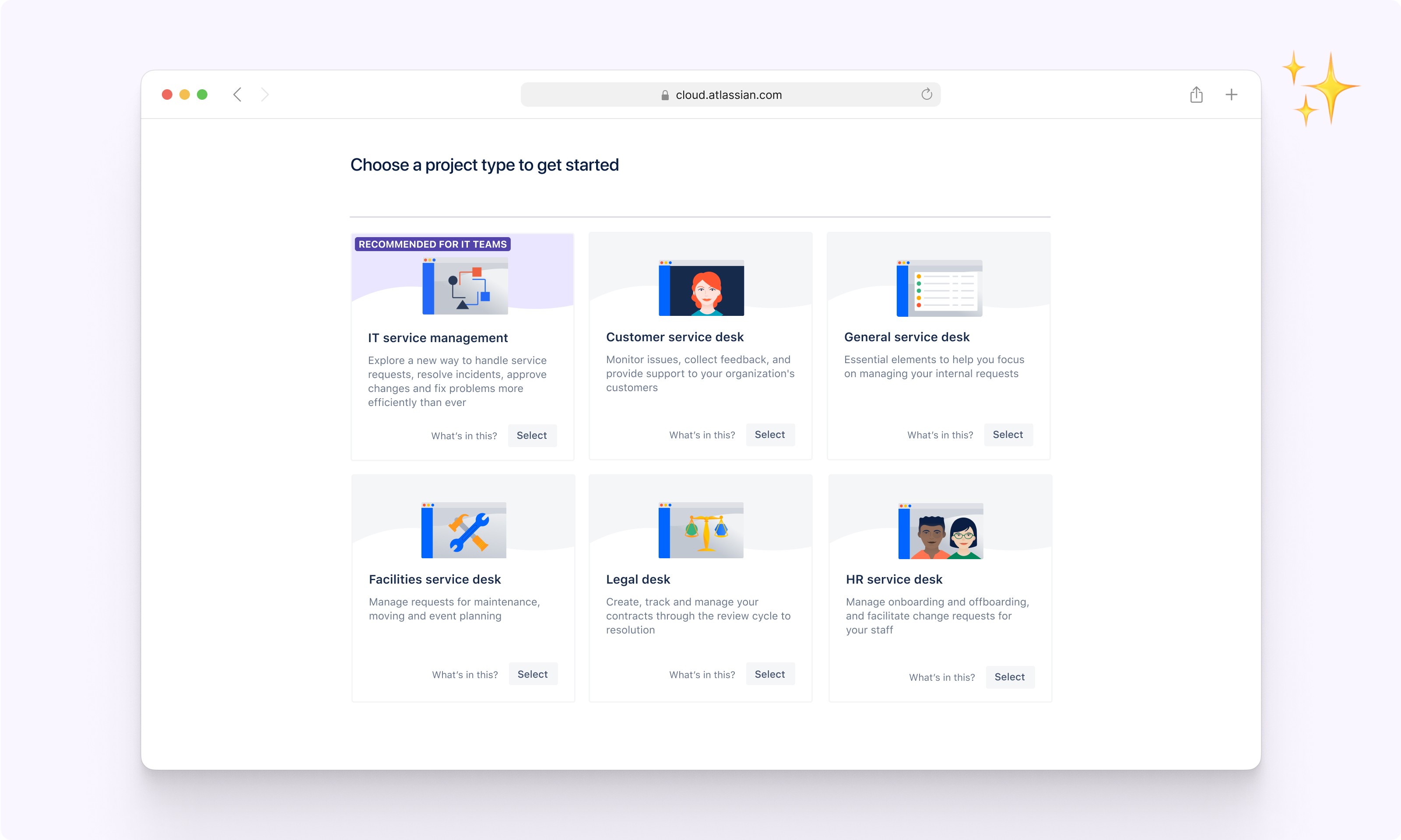
The bridge between marketing and in-product experiences
In November 2020, we launched the High-Velocity campaign. This was to announce the rebranding of Jira Service Desk (JSD) to Jira Service Management (JSM), along with the ITSM project template, boasting new features. To help educate new users, we needed to review the end-to-end onboarding experience, from sign-up to configuring their first ITSM project in the product. This case study will focus on the ‘Your Coach’ education experience.

Customer Pain
“Jira, I’m lost. Send help!”
What makes Jira so powerful is how customisable it is. What makes Jira so complex is knowing how to configure it In the right places. When customers land in JSM, they want to know how their team can use it and if it will work for them. How might we create a more positive first impression and encourage users to test the features?
Implementation
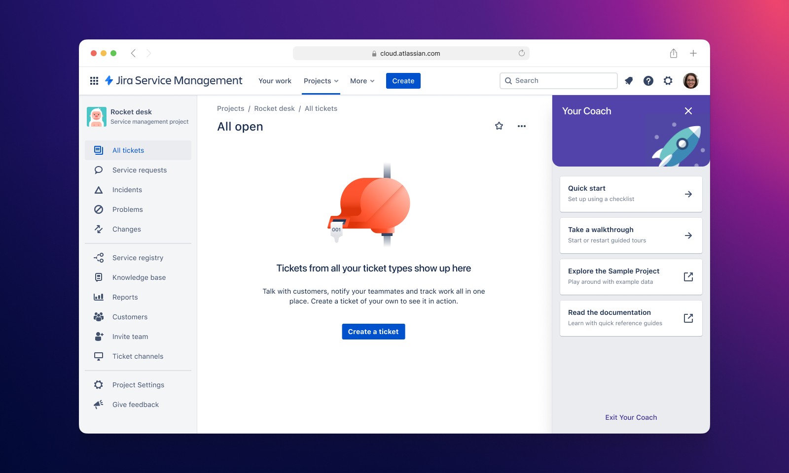
[ Prototype: https://yourcoach.framer.website/ ]
Your coach provides users with clear steps on how to move forward with onboarding
When it comes to IT Tools, we learned many types of IT users have individual learning styles. Some prefer step-by-step instructions, while some prefer to explore for themselves. By offering a range of educational material to support all learning styles, we hypothesised that users would be more inclined to test the features, increasing adoption and retention. These are the core features of Your Coach.
Setup Checklists - From basic tasks for setting up a service project to individual ITSM modules like change management and incident management, which require specific setup steps.
Walkthrough library - Users can start product tours to highlight the value of specific features without any setup required.
Sample project - Users can explore a project that has been pre-configured and pre-populated with data.
Key challenges
Many challenges presented themselves along the way. Here are the pivotal design challenges that I felt moulded the final solution.
Shaping learning pathways for new and existing users
Imagine creating a project from a template recommended for your needs, and all you see is an empty queue.
JSM has so many hidden features. We couldn’t expect our users to grasp it all in one go and know exactly what to learn. What’s more, we were challenged by our Head of Design to re-approach onboarding through the lens of an educational entity that lives on within the product and is accessible at any time a customer needs help.
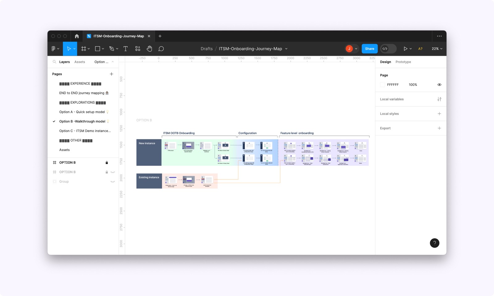
The 'walkthrough' conceptual model helped the team to consider
How to ease the steep learning curve for new users
How to encourage learning over time for existing users
Pre-existing mental models of other service desks
Activating incident management across two products
Imagine being eager to use a feature, only to learn the product requires you to edit some settings in another product. One that you did not sign up for nor familiar with.
Our onboarding team knew that this was not an ideal experience. The Incident management stream confirmed that improving this detail of the JSM and Opsgenie integration was out of scope. Nonetheless, it had to be solved through education.
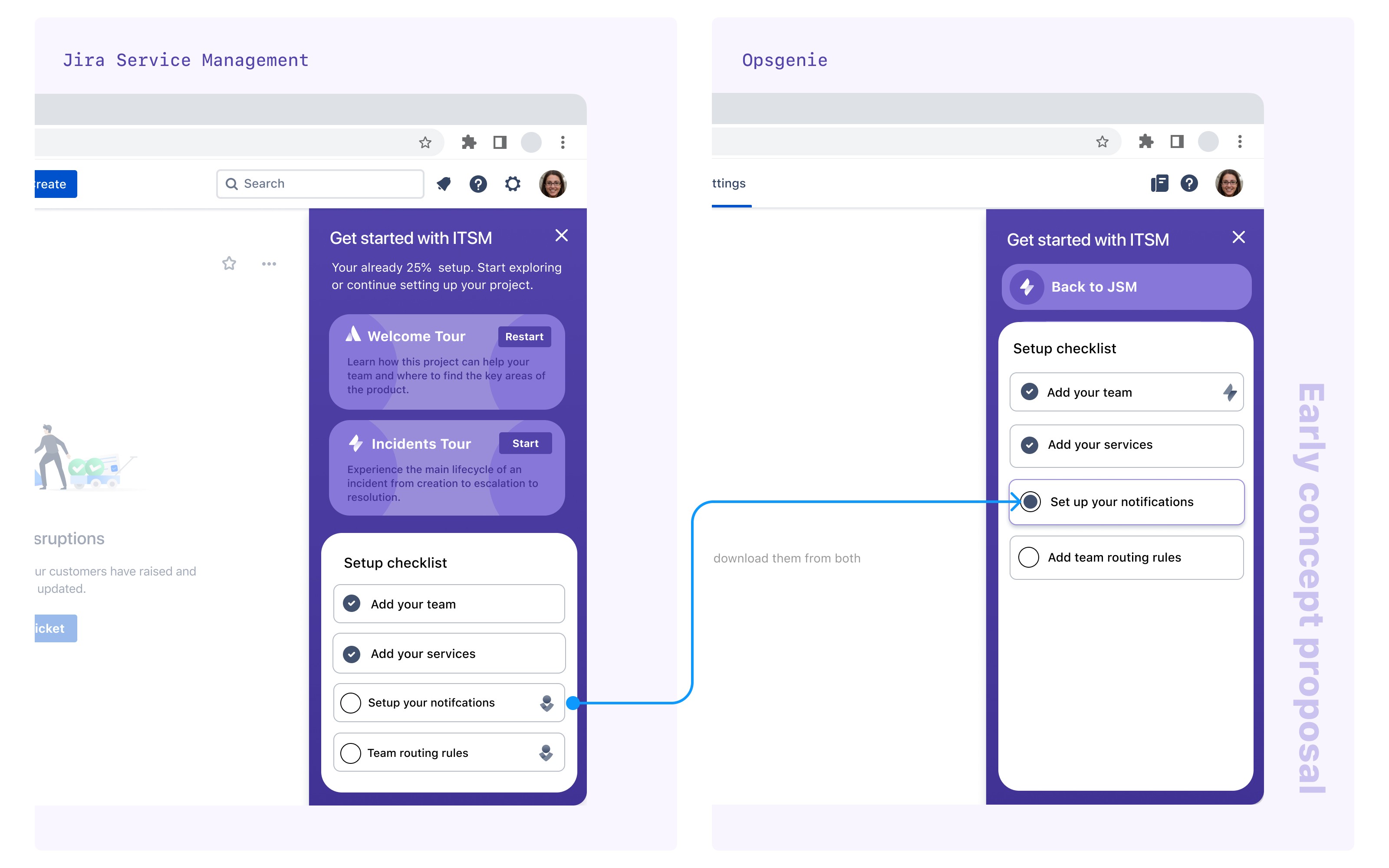
How could we possibly make this disconnected experience feel more seamless? There were some big decisions to be made.
Automatically provision a free version of Opsgenie for all JSM customers so they do not go through the sign-up process.
Align Opsgenie’s existing onboarding experience to ITSM’s proposed onboarding experience.
Specific to the configuration task, send customers directly to the intended settings page and communicate that it will be in Opsgenie.
Implement a new back-end service that could detect whether a setting has been enabled. Meaning we could update the configuration tasks as completed.
Here is a demo of the incident management configuration transition between Opsgenie and Jira Service Management.
Refining the look and feel
Performing our due diligence, we audited existing onboarding interfaces. Attentive to the goals and behaviour of various setup checklists. Our bespoke requirements for the IT onboarding experience presented an opportunity to design a much richer checklist and interaction pattern than was on offer. A lot of existing onboarding focused on showing users on how to use the product, whereas our Quickstart required some configuration steps. Quite similar to OpsGenie.
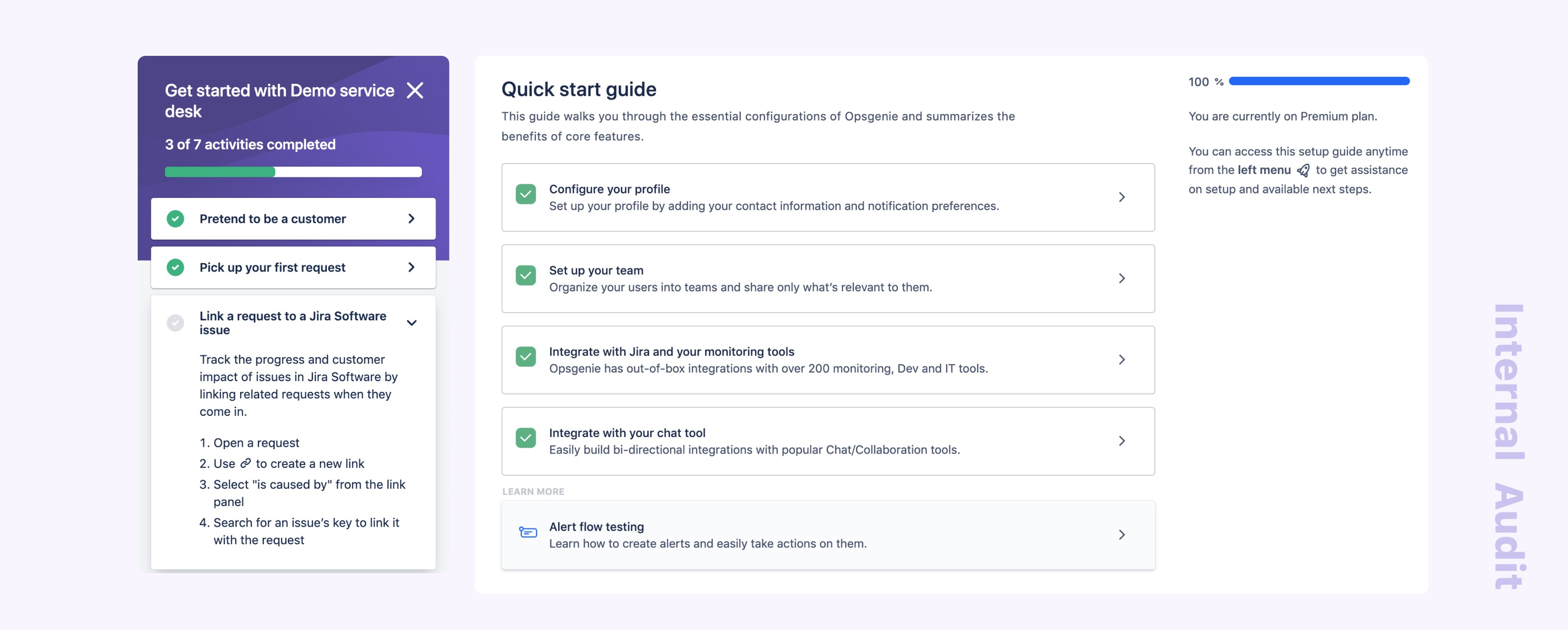
Our earlier explorations for the Your Coach panel took into consideration gamification elements, brand personality and information architecture. Along the way, we received feedback that there was “a lot going on” and interpreted this as the desire for simplicity.
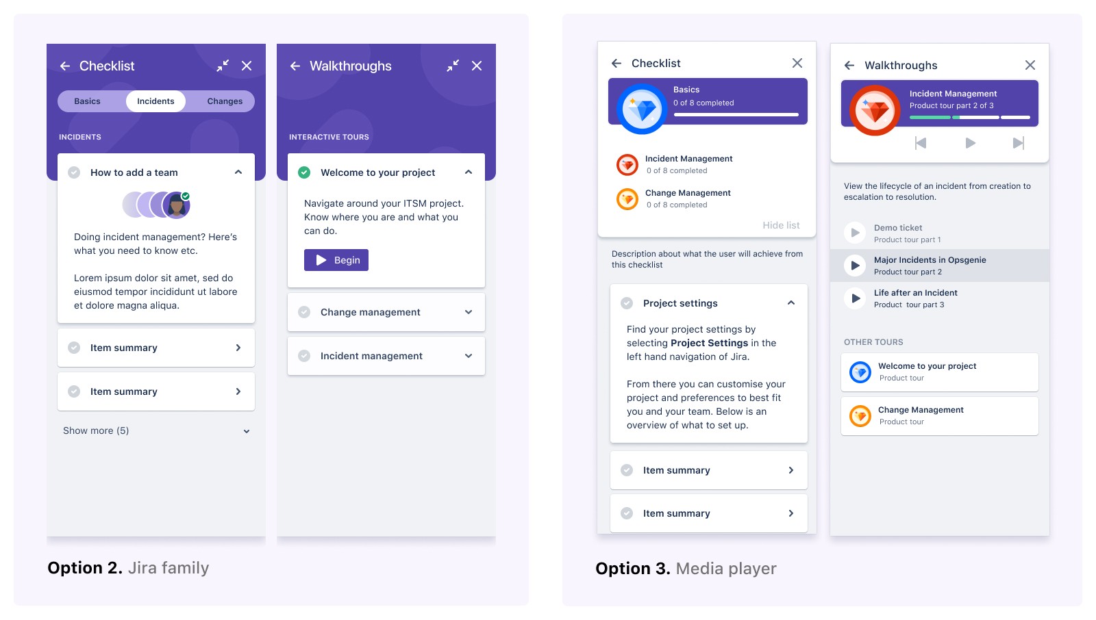
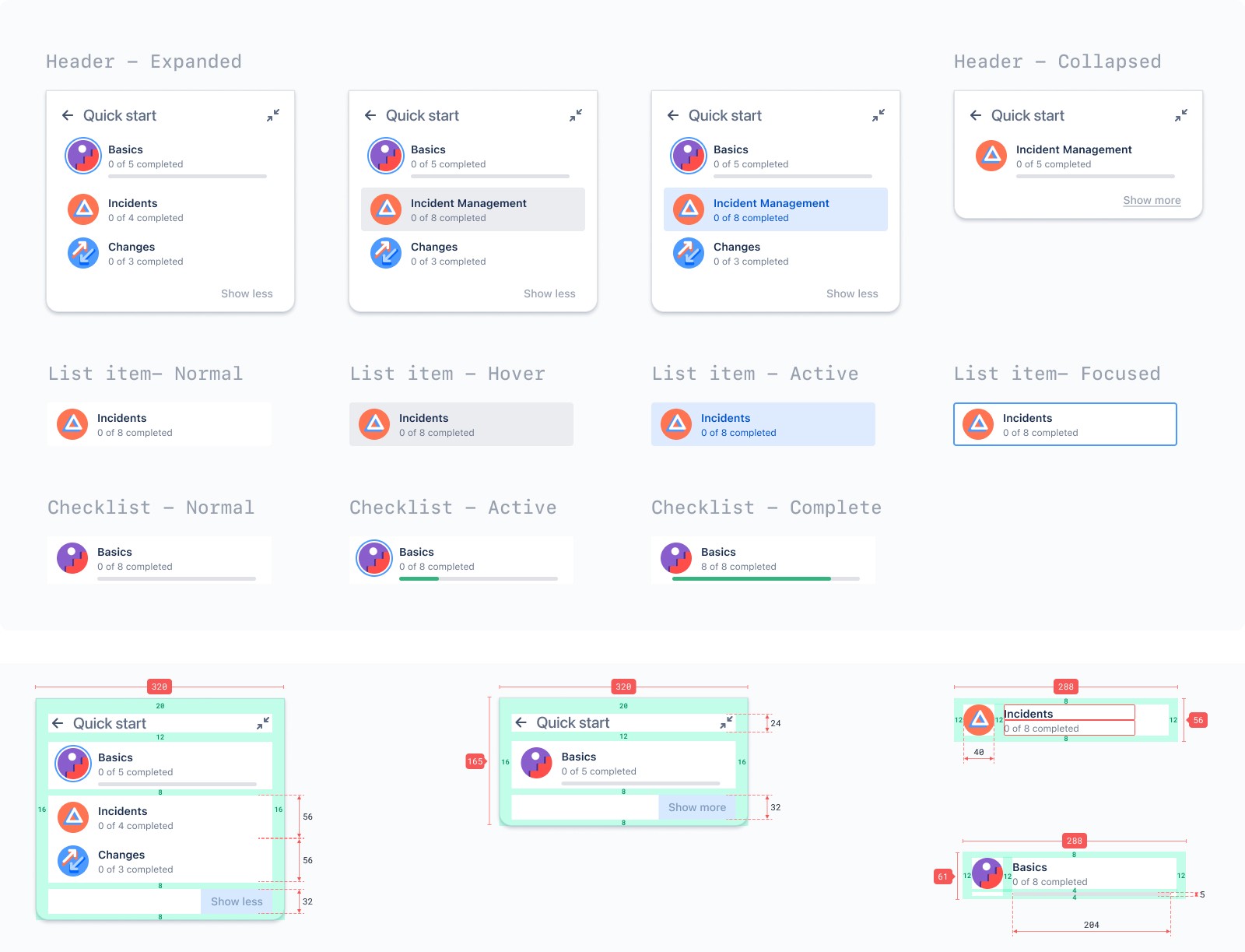
Our final design is optimised for clarity with the following design decisions.
Draw focus to the contents within the list by removing the media player analogy for product tours.
Unify the ITSM “card headers” into a modular component to ensure consistent treatment across all lists.
Display personality with colourful icons. Each ITSM module (basics, incidents, changes) remodels the current product icons.
We tested the design with a small group of IT admins, and they unanimously reported that the Your Coach panel was straightforward and behaved as they would expect any checklist to.
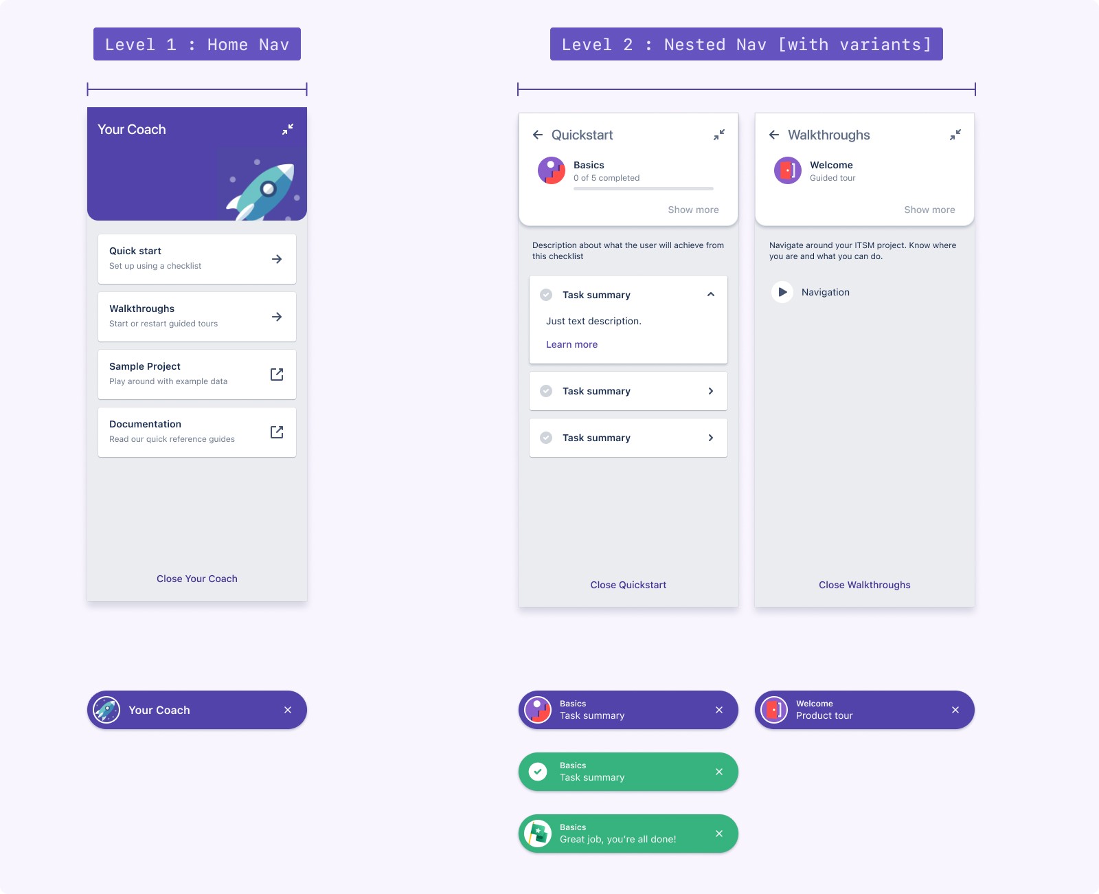
In the development documentation, we specify the anatomy, behaviour and different states of the panel. We future-proofed this panel design by implementing it as a web component. The web component has been reused for other checklists in the sample project and adopted by Opsgenie.
Impact
One month post-launch
One month after officially launching the High-Velocity campaign.
We saw a 10% increase in sign-ups.
Of all the templates created, 25% were ITSM templates.
Our welcome tours averaged a 30% completion rate. This is good, considering our users have different learning styles.
We surpassed our business targets and ultimately considered the campaign a success.
Learnings
A few months after the campaign, our results reverted to metrics seen before the campaign launch. These are my key takeaways from the project.
A personalised onboarding experience could provide us with insights into user motivations, so we can help them achieve their specific goals faster.
Education can only alleviate so much customer pain. We should focus more energy on improving the in-product configuration experience itself.
Moving tools usually involves migrating data. The time involved and the risk of things not working is expensive to businesses! There is an opportunity here to help mitigate risks.
Role
Product design, user journeys, co-design strategy, conceptual design, prototyping, UI system
Duration
March 2020 - Nov 2020
Context

Service management for the modern IT team
Atlassian recognises that as technology evolves the digital platforms in which we operate businesses, so do the processes of modern IT teams. It felt necessary that we reposition our marketing and product strategy from a traditional ‘help desk’ service to focus on IT Service Management (ITSM) practices. Where development and IT operations collaborate on a unified platform so they can respond to business changes and deliver great customer and employee service experiences fast.

The bridge between marketing and in-product experiences
In November 2020, we launched the High-Velocity campaign. This was to announce the rebranding of Jira Service Desk (JSD) to Jira Service Management (JSM), along with the ITSM project template, boasting new features. To help educate new users, we needed to review the end-to-end onboarding experience, from sign-up to configuring their first ITSM project in the product. This case study will focus on the ‘Your Coach’ education experience.

Customer Pain
“Jira, I’m lost. Send help!”
What makes Jira so powerful is how customisable it is. What makes Jira so complex is knowing how to configure it In the right places. When customers land in JSM, they want to know how their team can use it and if it will work for them. How might we create a more positive first impression and encourage users to test the features?
Implementation

[ Prototype: https://yourcoach.framer.website/ ]
Your coach provides users with clear steps on how to move forward with onboarding
When it comes to IT Tools, we learned many types of IT users have individual learning styles. Some prefer step-by-step instructions, while some prefer to explore for themselves. By offering a range of educational material to support all learning styles, we hypothesised that users would be more inclined to test the features, increasing adoption and retention. These are the core features of Your Coach.
Setup Checklists - From basic tasks for setting up a service project to individual ITSM modules like change management and incident management, which require specific setup steps.
Walkthrough library - Users can start product tours to highlight the value of specific features without any setup required.
Sample project - Users can explore a project that has been pre-configured and pre-populated with data.
Key challenges
Many challenges presented themselves along the way. Here are the pivotal design challenges that I felt moulded the final solution.
Shaping learning pathways for new and existing users
Imagine creating a project from a template recommended for your needs, and all you see is an empty queue.
JSM has so many hidden features. We couldn’t expect our users to grasp it all in one go and know exactly what to learn. What’s more, we were challenged by our Head of Design to re-approach onboarding through the lens of an educational entity that lives on within the product and is accessible at any time a customer needs help.

The 'walkthrough' conceptual model helped the team to consider
How to ease the steep learning curve for new users
How to encourage learning over time for existing users
Pre-existing mental models of other service desks
Activating incident management across two products
Imagine being eager to use a feature, only to learn the product requires you to edit some settings in another product. One that you did not sign up for nor familiar with.
Our onboarding team knew that this was not an ideal experience. The Incident management stream confirmed that improving this detail of the JSM and Opsgenie integration was out of scope. Nonetheless, it had to be solved through education.

How could we possibly make this disconnected experience feel more seamless? There were some big decisions to be made.
Automatically provision a free version of Opsgenie for all JSM customers so they do not go through the sign-up process.
Align Opsgenie’s existing onboarding experience to ITSM’s proposed onboarding experience.
Specific to the configuration task, send customers directly to the intended settings page and communicate that it will be in Opsgenie.
Implement a new back-end service that could detect whether a setting has been enabled. Meaning we could update the configuration tasks as completed.
Here is a demo of the incident management configuration transition between Opsgenie and Jira Service Management.
Refining the look and feel
Performing our due diligence, we audited existing onboarding interfaces. Attentive to the goals and behaviour of various setup checklists. Our bespoke requirements for the IT onboarding experience presented an opportunity to design a much richer checklist and interaction pattern than was on offer. A lot of existing onboarding focused on showing users on how to use the product, whereas our Quickstart required some configuration steps. Quite similar to OpsGenie.

Our earlier explorations for the Your Coach panel took into consideration gamification elements, brand personality and information architecture. Along the way, we received feedback that there was “a lot going on” and interpreted this as the desire for simplicity.

Our final design is optimised for clarity with the following design decisions.
Draw focus to the contents within the list by removing the media player analogy for product tours.
Unify the ITSM “card headers” into a modular component to ensure consistent treatment across all lists.
Display personality with colourful icons. Each ITSM module (basics, incidents, changes) remodels the current product icons.
We tested the design with a small group of IT admins, and they unanimously reported that the Your Coach panel was straightforward and behaved as they would expect any checklist to.

In the development documentation, we specify the anatomy, behaviour and different states of the panel. We future-proofed this panel design by implementing it as a web component. The web component has been reused for other checklists in the sample project and adopted by Opsgenie.

Impact
One month post-launch
One month after officially launching the High-Velocity campaign.
We saw a 10% increase in sign-ups.
Of all the templates created, 25% were ITSM templates.
Our welcome tours averaged a 30% completion rate. This is good, considering our users have different learning styles.
We surpassed our business targets and ultimately considered the campaign a success.
Learnings
A few months after the campaign, our results reverted to metrics seen before the campaign launch. These are my key takeaways from the project.
A personalised onboarding experience could provide us with insights into user motivations, so we can help them achieve their specific goals faster.
Education can only alleviate so much customer pain. We should focus more energy on improving the in-product configuration experience itself.
Moving tools usually involves migrating data. The time involved and the risk of things not working is expensive to businesses! There is an opportunity here to help mitigate risks.
Role
Product design, user journeys, co-design strategy, conceptual design, prototyping, UI system
Duration
March 2020 - Nov 2020
Context

Service management for the modern IT team
Atlassian recognises that as technology evolves the digital platforms in which we operate businesses, so do the processes of modern IT teams. It felt necessary that we reposition our marketing and product strategy from a traditional ‘help desk’ service to focus on IT Service Management (ITSM) practices. Where development and IT operations collaborate on a unified platform so they can respond to business changes and deliver great customer and employee service experiences fast.

The bridge between marketing and in-product experiences
In November 2020, we launched the High-Velocity campaign. This was to announce the rebranding of Jira Service Desk (JSD) to Jira Service Management (JSM), along with the ITSM project template, boasting new features. To help educate new users, we needed to review the end-to-end onboarding experience, from sign-up to configuring their first ITSM project in the product. This case study will focus on the ‘Your Coach’ education experience.

Customer Pain
“Jira, I’m lost. Send help!”
What makes Jira so powerful is how customisable it is. What makes Jira so complex is knowing how to configure it In the right places. When customers land in JSM, they want to know how their team can use it and if it will work for them. How might we create a more positive first impression and encourage users to test the features?
Implementation

[ Prototype: https://yourcoach.framer.website/ ]
Your coach provides users with clear steps on how to move forward with onboarding
When it comes to IT Tools, we learned many types of IT users have individual learning styles. Some prefer step-by-step instructions, while some prefer to explore for themselves. By offering a range of educational material to support all learning styles, we hypothesised that users would be more inclined to test the features, increasing adoption and retention. These are the core features of Your Coach.
Setup Checklists - From basic tasks for setting up a service project to individual ITSM modules like change management and incident management, which require specific setup steps.
Walkthrough library - Users can start product tours to highlight the value of specific features without any setup required.
Sample project - Users can explore a project that has been pre-configured and pre-populated with data.
Key challenges
Many challenges presented themselves along the way. Here are the pivotal design challenges that I felt moulded the final solution.
Shaping learning pathways for new and existing users
Imagine creating a project from a template recommended for your needs, and all you see is an empty queue.
JSM has so many hidden features. We couldn’t expect our users to grasp it all in one go and know exactly what to learn. What’s more, we were challenged by our Head of Design to re-approach onboarding through the lens of an educational entity that lives on within the product and is accessible at any time a customer needs help.

The 'walkthrough' conceptual model helped the team to consider
How to ease the steep learning curve for new users
How to encourage learning over time for existing users
Pre-existing mental models of other service desks
Activating incident management across two products
Imagine being eager to use a feature, only to learn the product requires you to edit some settings in another product. One that you did not sign up for nor familiar with.
Our onboarding team knew that this was not an ideal experience. The Incident management stream confirmed that improving this detail of the JSM and Opsgenie integration was out of scope. Nonetheless, it had to be solved through education.

How could we possibly make this disconnected experience feel more seamless? There were some big decisions to be made.
Automatically provision a free version of Opsgenie for all JSM customers so they do not go through the sign-up process.
Align Opsgenie’s existing onboarding experience to ITSM’s proposed onboarding experience.
Specific to the configuration task, send customers directly to the intended settings page and communicate that it will be in Opsgenie.
Implement a new back-end service that could detect whether a setting has been enabled. Meaning we could update the configuration tasks as completed.
Here is a demo of the incident management configuration transition between Opsgenie and Jira Service Management.
Refining the look and feel
Performing our due diligence, we audited existing onboarding interfaces. Attentive to the goals and behaviour of various setup checklists. Our bespoke requirements for the IT onboarding experience presented an opportunity to design a much richer checklist and interaction pattern than was on offer. A lot of existing onboarding focused on showing users on how to use the product, whereas our Quickstart required some configuration steps. Quite similar to OpsGenie.

Our earlier explorations for the Your Coach panel took into consideration gamification elements, brand personality and information architecture. Along the way, we received feedback that there was “a lot going on” and interpreted this as the desire for simplicity.

Our final design is optimised for clarity with the following design decisions.
Draw focus to the contents within the list by removing the media player analogy for product tours.
Unify the ITSM “card headers” into a modular component to ensure consistent treatment across all lists.
Display personality with colourful icons. Each ITSM module (basics, incidents, changes) remodels the current product icons.
We tested the design with a small group of IT admins, and they unanimously reported that the Your Coach panel was straightforward and behaved as they would expect any checklist to.

In the development documentation, we specify the anatomy, behaviour and different states of the panel. We future-proofed this panel design by implementing it as a web component. The web component has been reused for other checklists in the sample project and adopted by Opsgenie.

Impact
One month post-launch
One month after officially launching the High-Velocity campaign.
We saw a 10% increase in sign-ups.
Of all the templates created, 25% were ITSM templates.
Our welcome tours averaged a 30% completion rate. This is good, considering our users have different learning styles.
We surpassed our business targets and ultimately considered the campaign a success.
Learnings
A few months after the campaign, our results reverted to metrics seen before the campaign launch. These are my key takeaways from the project.
A personalised onboarding experience could provide us with insights into user motivations, so we can help them achieve their specific goals faster.
Education can only alleviate so much customer pain. We should focus more energy on improving the in-product configuration experience itself.
Moving tools usually involves migrating data. The time involved and the risk of things not working is expensive to businesses! There is an opportunity here to help mitigate risks.
Want to team up or learn more about my process?
💌
hello@jenifferheng.com
© All rights reserved ·
Last updated June 2024
Want to team up or learn more about my process?
💌
hello@jenifferheng.com
© All rights reserved ·
Last updated June 2024
Want to team up or learn more about my process?
💌
hello@jenifferheng.com
